- Charity & Community Services
- North Halifax Partnership
Making community support easier to access.
Accessible brand and website design shaped around clarity, usability and better access to local services.
North Halifax Partnership is a community-focused charity based in Halifax, dedicated to improving the health, wellbeing, and opportunities of people across the local area. Through a wide range of services and activities, they support children, families, older people, and individuals at every stage of life.
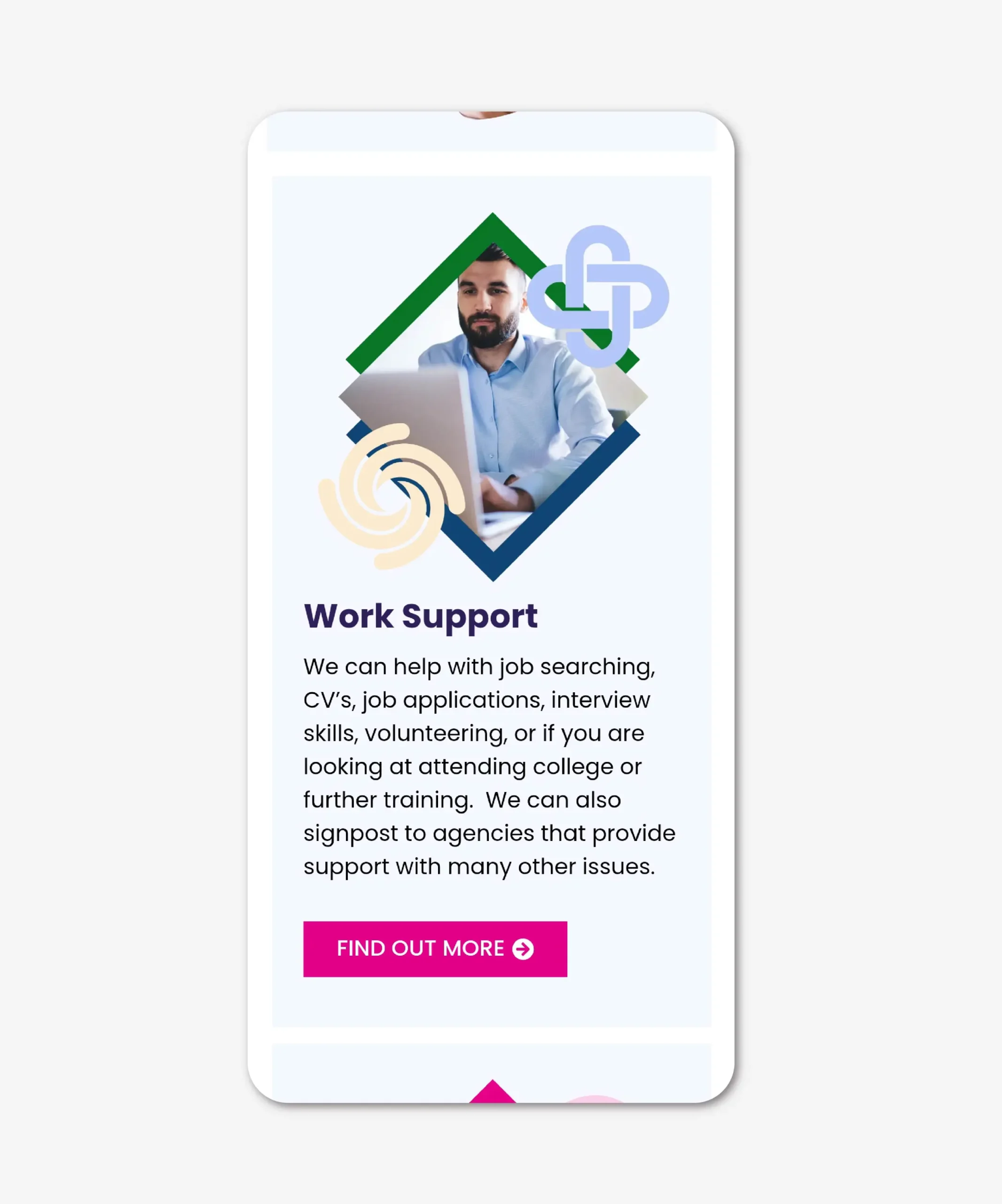
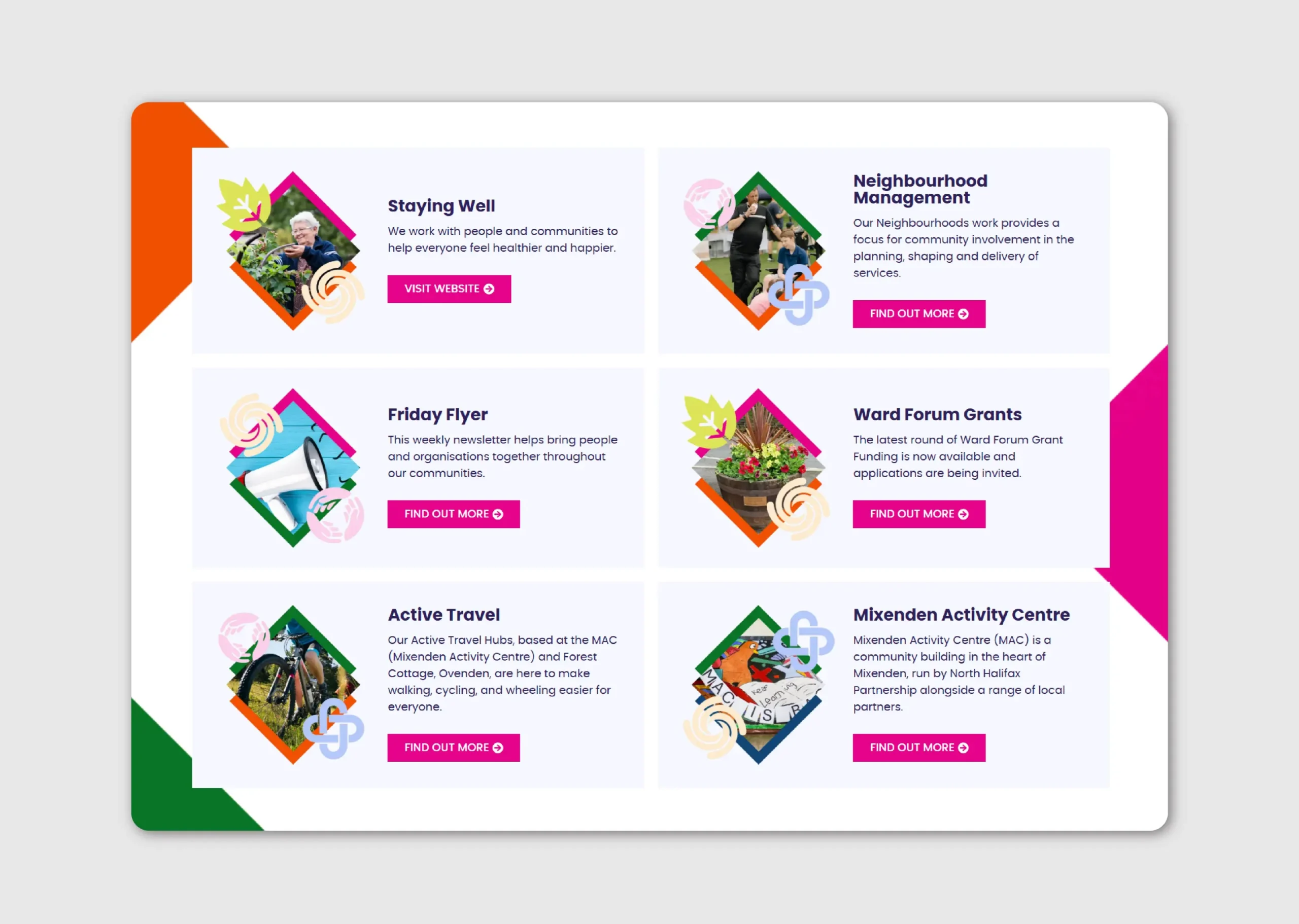
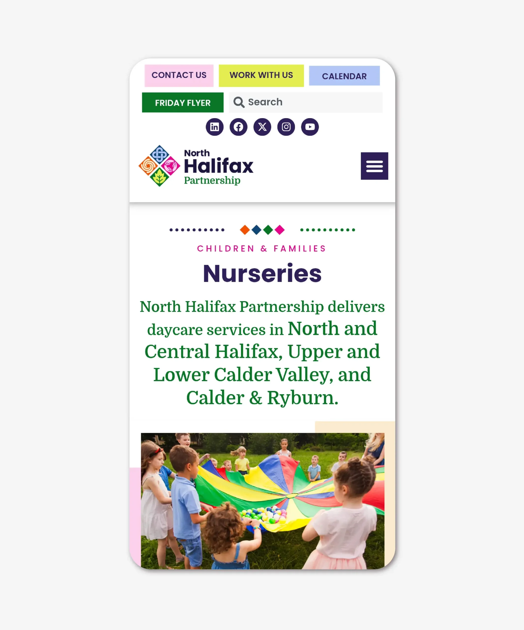
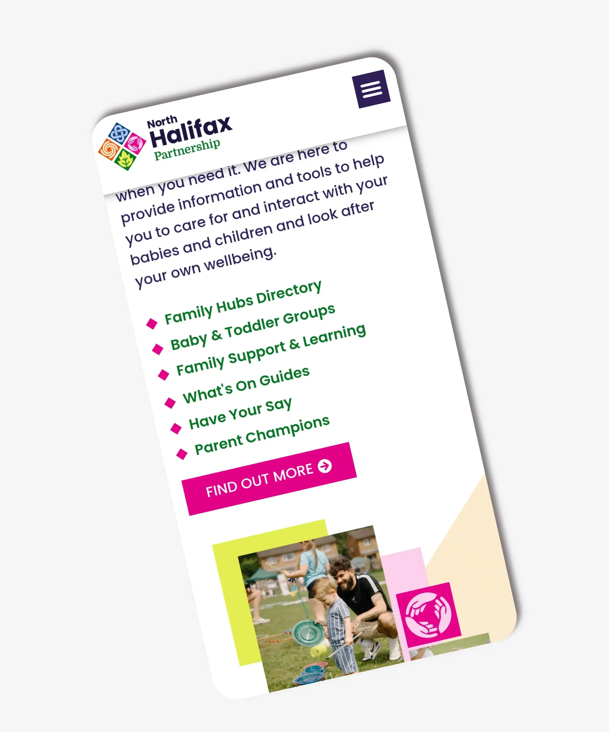
Their work is delivered through three core service areas: Children & Families, Community & Wellbeing, and Learning & Development. Children and family services include family support and learning, toddler groups, Family Hubs, and nurseries. Their community programmes focus on wellbeing initiatives, neighbourhood planning, staying active workshops, cycling schemes, and grant funding for local projects and learning groups. Alongside this, their Learning & Development services provide training, skills development, employability support such as CV writing and job applications, family first aid, and a diverse programme of learning sessions including Baby Massage, Understanding Autism, Pilates, and breastfeeding support.
What They Asked For
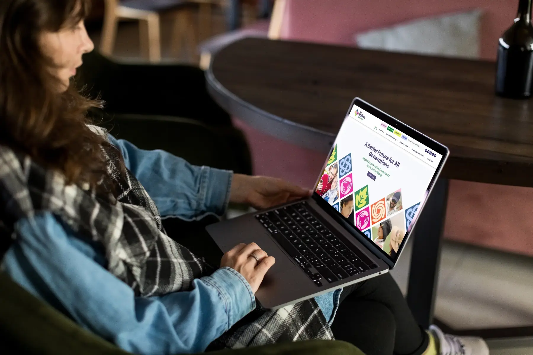
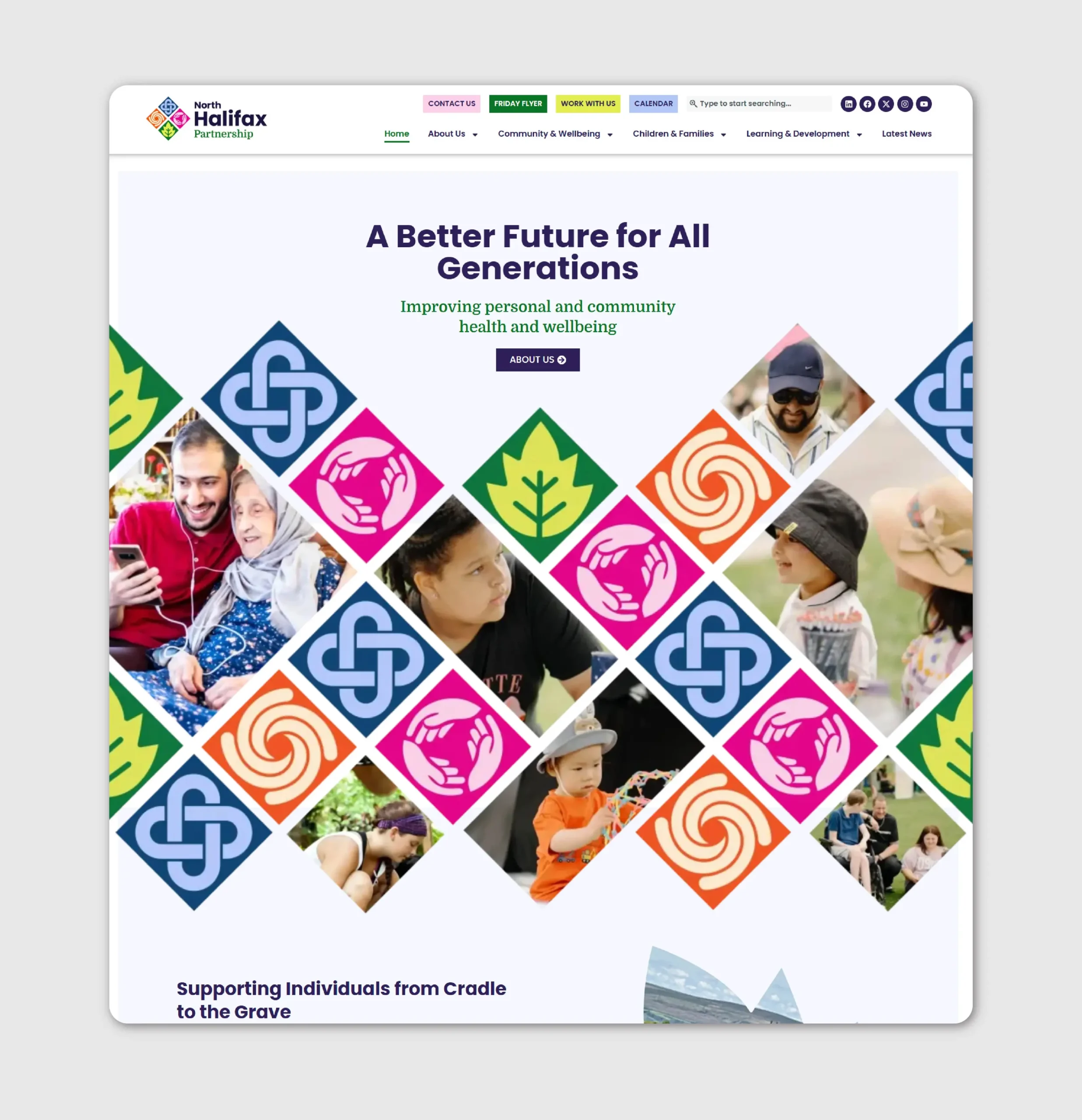
Following the award of a new Halifax Family Hub and the expansion of their family services, North Halifax Partnership felt it was the right time to evolve their brand and digital presence. Having recently celebrated their 25th anniversary, they wanted a refreshed identity and a new website that truly reflected the scale, impact, and value of the work they deliver within the community. Their existing website was no longer meeting the needs of either users or the internal team. Information about services, workshops, and events was difficult to find, the site was not optimised for mobile, and accessibility had not been considered in its original design. Managing content had also become increasingly challenging, with the platform proving restrictive and time-consuming for the team to update.
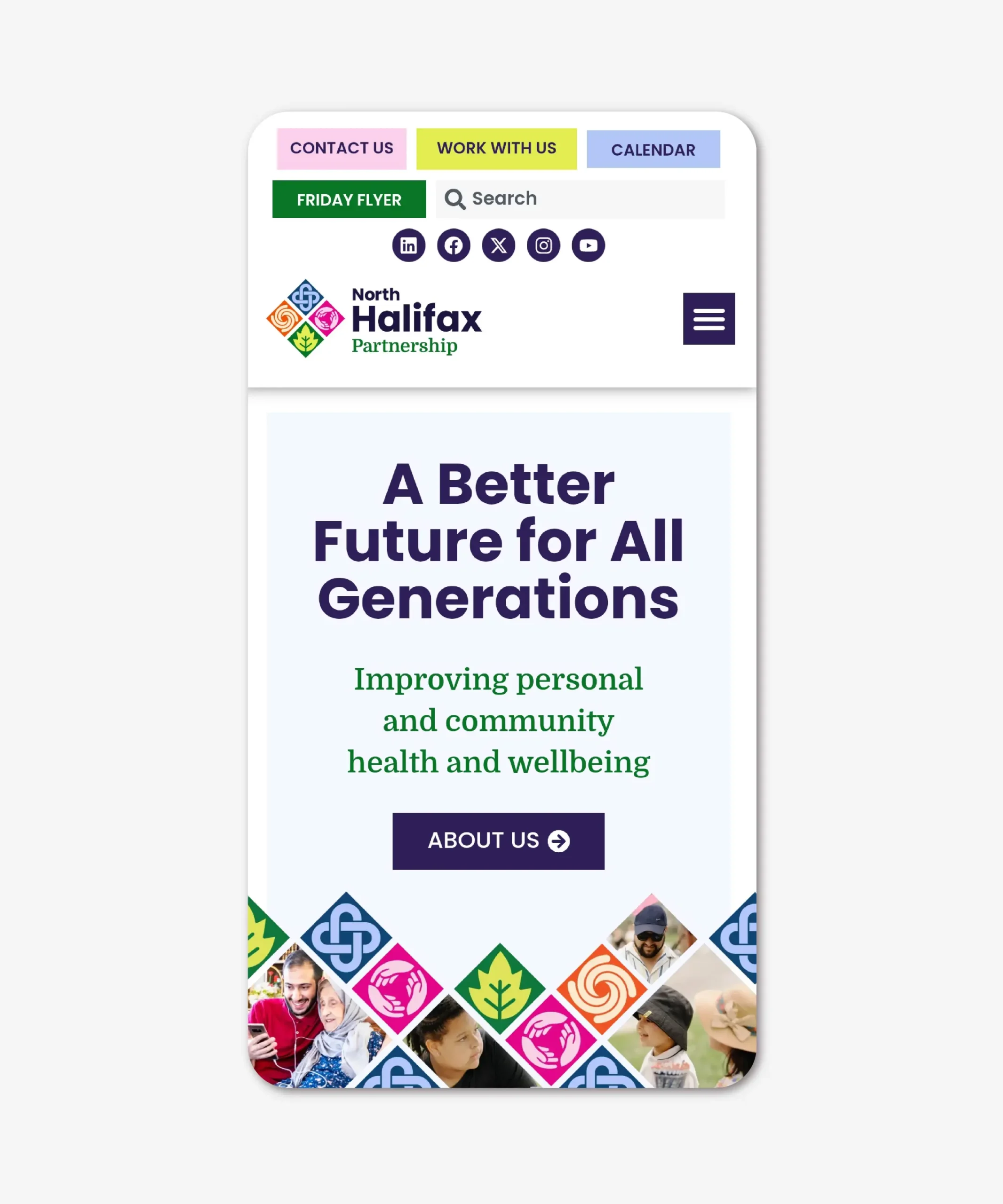
Visually, the brand felt outdated and lacked a clear, distinctive identity, often leading to confusion rather than clarity. North Halifax Partnership were looking for a new brand that reflected their values, history, and legacy, while connecting more effectively with the people they support. This identity would be rolled out across a full suite of brand assets, including social media, print materials, email communications, and the website. Alongside the new brand, they required a colourful, engaging, and accessible website that was intuitive for users and easy for the team to manage. Key requirements included a clear structure, improved user journeys, and the ability to upload and manage events and workshops, with the option for online booking.
What We Did
Our approach began with North Halifax Partnership’s four core values. Collaboration, Local & Green, Inclusivity, and Empowerment.
These values sit at the heart of everything NHP delivers, and they became the foundation for both the brand identity and the website. We translated each value into a series of bespoke icons, which together form a modern, crest-style logo system. The icons were intentionally designed to be symbolic rather than literal, avoiding overused visual clichés while remaining simple, contemporary, and accessible. This iconography was then extended into patterns and graphic elements that underpin the wider brand style.
Accessibility played a key role in the development of the colour palette. The previous brand relied on dark, muted tones, so we introduced a brighter, more uplifting palette that better reflected NHP’s energy and the diversity of their services. Every colour combination was tested using accessibility checkers to ensure contrast and readability consistently met accessibility standards. The result is a more engaging and inclusive visual language that works confidently across all touchpoints.
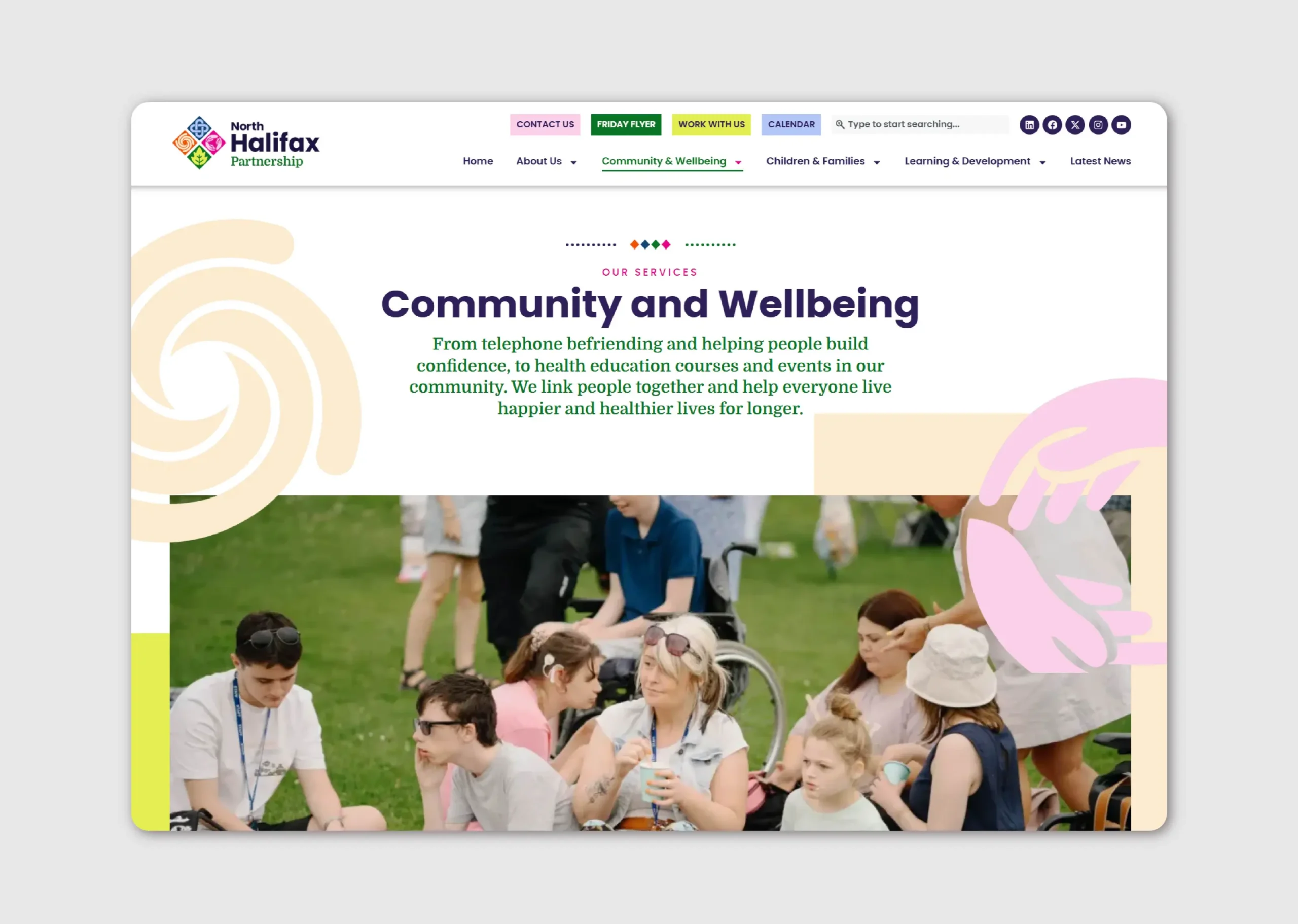
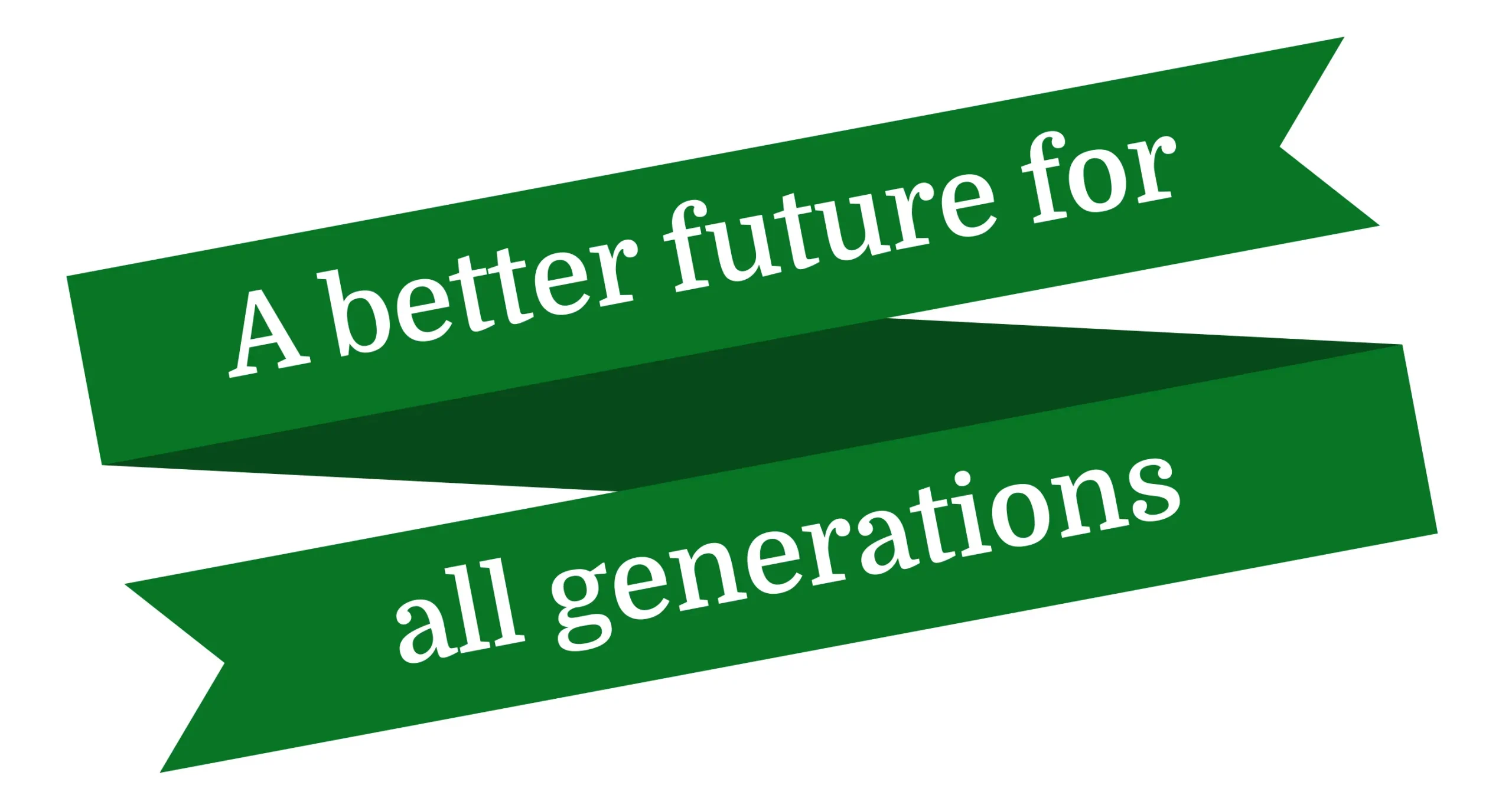
NHP’s strapline is an important part of their identity, but its length had previously caused legibility issues at smaller sizes. To address this, we developed a separate strapline mark, allowing the main logo to remain clean and flexible while giving the strapline its own distinctive presence. This secondary mark is now used across marketing materials and the website to strengthen brand recognition and reinforce key messaging. The website required a complete restructure to improve usability for both visitors and the internal team. We simplified the navigation by merging content, removing outdated pages, and creating a clear, intuitive sitemap. With the structure in place, we designed layouts, planned content hierarchy, and mapped out the booking system. Wireframes were shared for feedback before moving into the visual design phase.
Creatively, the website design responds directly to the site structure. Top-level pages feature custom graphics, icons, and imagery, with bold, engaging layouts designed to capture attention and guide users towards key services. Secondary and tertiary pages focus on clarity and ease of use, presenting more detailed information with minimal distraction and clear calls to action. Throughout the build, accessibility checks were carried out and the website was designed with the NHP team firmly in mind. Flexible templates, dynamic content, and conditional logic ensure the brand is applied automatically, giving the team confidence to add events, blogs, and new pages without breaking the site or compromising the design. The result is an accessible, intuitive website that empowers the team to manage content with ease and consistency.
Project Highlights
- Accessibility-led design approach applied consistently from brand identity through to website design
- Bespoke iconography, image masks, patterns, and graphic elements developed specifically for the new brand
- Complete website restructure to improve user experience and give the team confidence in managing content
- Intuitive events calendar and booking system that is easy to update and manage
- Fully responsive website design that delivers a seamless experience across all devices
Testimonial
“We couldn’t be happier with Grinning Graphics! We chose them because of their impressive portfolio and their experience working with charities, and they absolutely delivered. They developed our new website and brand, and the results are fantastic – modern, user-friendly, and perfectly aligned with our vision.
The team really took the time to understand our goals and brought ideas that exceeded our expectations. Communication was excellent throughout, and the whole process was seamless. Our new brand and website have already received so many compliments, and we’re confident it will help us make a big impact.
We would wholeheartedly recommend Grinning Graphics to anyone looking for a talented, reliable, and creative design team, especially in the charity sector.
A special thank you to Kate, who guided us through every step with professionalism, creativity, and patience – she really made the whole experience enjoyable and stress-free.”
Chloe Beckett
Marketing & Communications Manager, North Halifax Partnership