
Minimalism is one of those words that feels familiar until you try to define it. Most people associate it with a particular look. Lots of white space. Neutral colours. Simple layouts. Pared-back typography. Scroll through brand identities, websites, or social feeds and you’ll see it everywhere. Minimalism has become shorthand for “clean” or “modern”. But that understanding only scratches the surface. At Grinning Graphics, we’ve learned that the minimalism that actually improves brands and websites has very little to do with aesthetics alone. The kind of minimalism that works isn’t a visual shortcut. It’s more like a decision-making process, a way of choosing what matters and letting go of what doesn’t. True minimalism is about reducing noise so meaning can come through more clearly.
That raises some important questions. What does minimalism in design really mean once you strip away the trend language? Why do so many websites that look minimal still feel vague, generic, or ineffective? Where does minimalism actually begin, in layouts and typography, or much earlier in strategy, positioning, and messaging? How does minimalism improve usability and experience, beyond appearances? And why, if it’s about “less”, is it so difficult to do well? This blog will explore these questions. We’ll look at what minimalism really looks like when it’s employed as a design discipline rather than just as a visual style.
Minimalism in Design: Removing What Gets in the Way
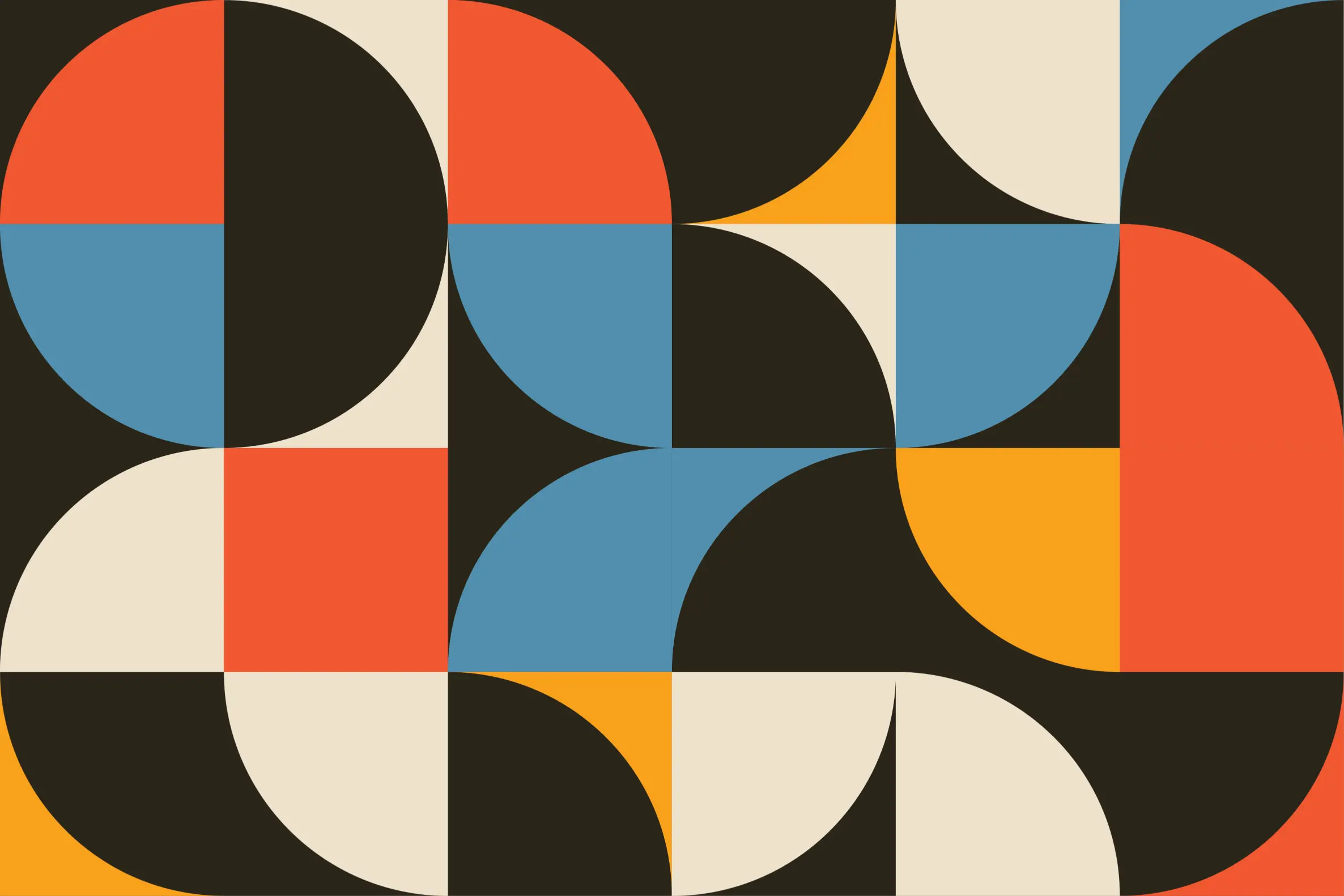
Minimalism in design isn’t about stripping things back for the sake of it. Done properly, minimalist design is about removing anything that doesn’t support purpose. It prioritises clarity over decoration, structure over flourish, and intent over excess. Every element that remains has a reason to exist. Typography isn’t chosen because it’s fashionable. Colour isn’t added for interest alone. Space isn’t empty, it’s doing work. This is why minimalism is best understood as clarity made visible. When it works, it helps people understand who you are, what you do, and why it matters. This way of thinking has deep roots in graphic design, long before minimalism became a popular visual trend in branding and web design. As the British Academy of Graphic Design highlights in its recent exploration of minimalist graphic design, the real impact of minimalism comes from purposeful reduction. Designers have always known that visual clarity depends as much on what you leave out as what you include. When minimalism is applied well, it doesn’t feel bare or unfinished. It feels intentional. Layouts feel balanced rather than sparse. Hierarchy feels calm rather than rigid. Space becomes a tool for guiding attention. Typography, colour and imagery are used sparingly, but with intent. Each element earns its place.
Where minimalism often goes wrong is when it’s treated as a surface-level aesthetic rather than a strategic design approach. One of the most common misconceptions is that visual simplicity automatically creates clarity. It doesn’t. A website can look minimal and still be conceptually noisy. Clean layouts don’t fix unclear positioning. Neutral colour palettes don’t compensate for vague messaging. When brands skip the hard thinking and jump straight to layouts, fonts and colour choices, minimalism becomes cosmetic. It looks tidy, but it doesn’t communicate. True minimalism starts much earlier in the branding and design process. It begins with decisions about focus, priorities and intent. It asks what really matters here, and has the confidence to remove everything that doesn’t support that answer. At its best, minimalism simplifies in service of meaning. It removes distractions that dilute the message and creates space for understanding. That’s why, when minimalist design is done properly, it feels clearer, calmer and more effective.

Where Minimalism Really Starts: Decisions Before Design
True minimalism starts with thinking. Before anything is designed, there needs to be clarity about who a brand is for, what problem it solves, and why it exists at all. This is why so many “minimal” websites still feel vague or ineffective. The visuals may be quiet, but the thinking behind them is noisy. Clean layouts don’t fix unclear positioning. Neutral colours don’t compensate for uncertain messaging. When brands skip the hard work of defining what matters and jump straight to aesthetics, minimalism becomes cosmetic. It looks tidy, but it doesn’t communicate.
When minimalism is applied properly, it doesn’t feel empty or stripped back. By removing anything unnecessary, it creates space for understanding and allows the essential parts of a message to stand on their own. Clarity depends as much on what you leave out as what you include. In minimalist design, space isn’t empty. It’s doing work. Typography, colour and imagery are used sparingly, but with purpose. Each element earns its place. Minimalism doesn’t just simplify, it removes distractions that dilute the message and focuses attention on what actually needs to be seen, read or understood.
Minimalism and Meaning: Saying the Right Things More Clearly
Minimalism isn’t merely about reducing visual complexity. Many brands manage to make their websites look minimal while remaining conceptually cluttered. The pages feel calm, but the message is still unclear. That’s because minimalism doesn’t replace strong thinking, it amplifies it. When visual noise is removed, every remaining word and decision becomes more visible. There’s nowhere to hide weak ideas behind decoration or complexity. This is why minimalism isn’t a shortcut. It’s a discipline. It forces brands to decide what they actually want to say, and to trust that it’s enough. If positioning hasn’t been resolved, minimalism makes that obvious very quickly. But when clarity is in place, minimalism becomes powerful. Messaging becomes more direct. Design decisions become simpler.
This clarity has a direct impact on experience, not just appearance. By reducing visual and cognitive clutter, minimalism reduces friction. People can process information more easily, find what they need faster, and feel more confident navigating and making decisions. Clear hierarchy, restrained layouts and focused content lower cognitive load and make digital experiences feel calmer and more intuitive. In environments where attention is already stretched thin, fewer distractions mean fewer points of friction. In that sense, minimalism isn’t just about taste or trend. It’s about usability. It’s about respecting your audience’s time, attention and mental bandwidth, and designing in a way that helps rather than overwhelms.

Why Minimalism Is Harder Than It Looks: Confidence, Restraint and Personality
There’s an uncomfortable truth behind minimalist design. It isn’t less work. It’s more work upfront. Removing elements is easy. Deciding what can be removed without weakening meaning takes time, judgement and experience. When there’s less on the page, every choice becomes more visible. Every remaining element has to justify its presence. That’s why minimalism often signals maturity in a brand. It suggests an organisation understands itself well enough to be selective. Minimalism demands restraint, but it also demands confidence. It means trusting that what remains is strong enough to carry the message on its own. This is why minimalist projects often require closer collaboration between designers and clients. It’s a shared commitment to clarity.
One of the most persistent myths around minimalism is that it strips away personality. In reality, minimalism doesn’t remove character, it focuses it. Bold typography, expressive colour, confident language and even moments of playfulness can all exist within a minimalist framework, as long as they serve a purpose. Minimalism demands intention. When noise is removed, personality often comes through more clearly, not less. Minimalist brands can feel warm, confident and human precisely because they aren’t competing with unnecessary distractions.
Conclusion: Minimalism as a Strategic Advantage – Why Who You Work With Matters
When you step back, minimalism stops looking like a visual style and starts looking like a brand discipline. It’s the ongoing practice of questioning what belongs and what doesn’t. Of choosing clarity over reassurance. Of resisting the urge to add simply because you can. This is why who you work with matters. Minimalism isn’t something you apply at the end of a project. It has to run through branding, messaging, structure and decision-making from the very beginning. Designers who understand minimalism as a discipline, not just an aesthetic, ask different questions. They help brands make clearer choices. When minimalism is grounded in real brand clarity, it becomes one of the most powerful tools a brand can use. It makes websites easier to navigate. It makes messaging easier to write. It makes design systems easier to maintain.
At Grinning Graphics, we use minimalism to create clarity, confidence and focus. Our branding services are rooted in helping organisations define what really matters, so design decisions become simpler, stronger and more purposeful. And when that thinking carries through into web design and development, it results in websites that are easier to use, easier to understand and far more effective.
If you’re considering a branding or website project and want to work with designers who understand the power of minimalism and purposeful reduction, we’d love to talk.
Contact us today or book a discovery call and let’s explore what your brand could say if it stopped trying to say everything.