- Community Action
- Calderdale Community CPR
Bringing a life-saving community mission into focus.
Brand and website design that made the charity’s purpose clearer, helped built trust and encouraged more people to get involved.
Calderdale Community CPR Fund is dedicated to increasing the survival rate of cardiac arrests through fully funded CPR training and defibrillator installations. Their mission is to introduce CPR to people all over Calderdale, and help save lives by informing and training the community about the heart, CPR, and defibrillation.
They wanted a new website to help enhance their online presence and encourage community engagement, to communicate their mission, and provide essential resources for CPR awareness and training. They also wanted a bold and recognisable brand identity that would reflect their mission, enhance their impact, and help strengthen their presence and build trust in the community.
Calderdale Community CPR Fund did not previously have its own website or a recognisable brand identity. Founder Neil Davidson, a cardiac arrest survivor, had been running a Facebook group, which served as the fund’s online hub. In lieu of a brand identity, the Fund had been using a basic, heart-shaped logo that Neil had pieced together himself.
Client Name:
Industry:
Charity, Non-Profit
Location
Halifax, Calderdale, West Yorkshire


What We Did
Our goal was to create a responsive and accessible website that would serve as a central digital hub for CPR and defibrillator information, resources, and community engagement. The hub would also encourage donations and volunteer sign-ups. We also aimed to create a modern, professional, cohesive brand identity that helps build trust and recognition within the community and that would work effectively and cohesively across digital and print media.


Website Design
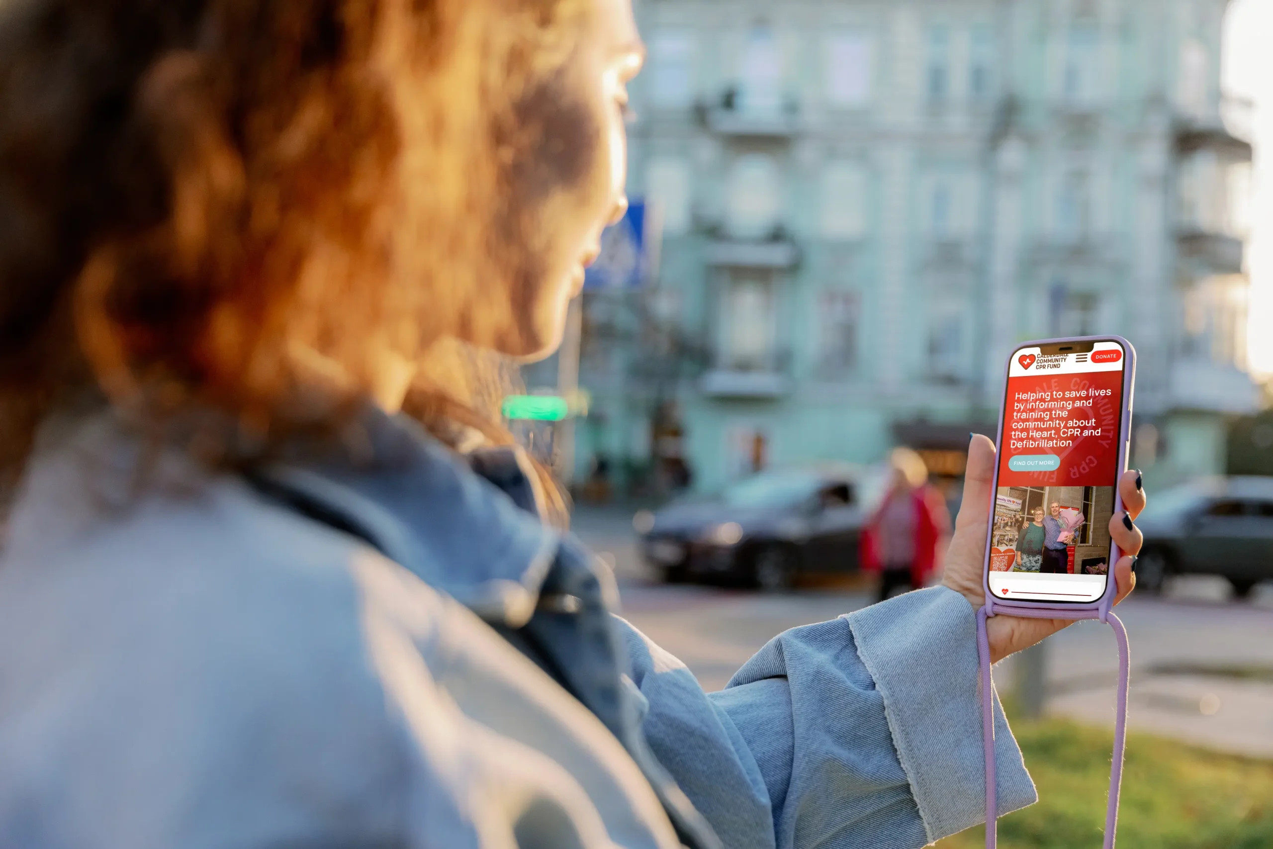
We started with a user-first approach, ensuring the website was intuitive and easy to navigate. Key design considerations included clear navigation, engaging visuals, and mobile-optimised design. We developed a simple menu structure to guide users to key pages effortlessly. For engaging visuals, we created a balance of imagery and clean layouts to emphasise their mission, and we ensured all designs were optimised for mobile, ensuring a seamless experience across all devices.
To establish a strong and professional presence, we created a cohesive brand identity, including a warm yet bold colour palette featuring a combination of reds and blues, symbolising urgency, trust, and action, a clear and modern font selection for readability and accessibility, and a consistent use of brand elements across the website to maintain a professional and unified look and brand experience.
The website was built for speed, security, and accessibility. Fast and responsive, optimised for quick load times and smooth user interactions. We ensured we implemented the latest WCAG accessibility standards to ensure we created an inclusive design accessible to all.
The key features and functionalities we developed for the website included a CPR Training Information Hub that features a clear breakdown of training sessions, events, and resources, and a Defibrillator Location Guide, helping users understand the importance of defibrillators and helping them locate defibrillators in their area. We also included community engagement features, including a prominent, ‘sticky’ donation button to maximise donation visibility to encourage site visitors to make donations, as well as partnerships and volunteer opportunities. We future-proofed the website, ensuring that the design and layout were secure and scalable, with the ability to expand the site as the organisation grows and develops in the future.
Brand Identity Design
We worked closely with Neil to define the core attributes of the brand. The new identity needed to feel trustworthy and professional, and approachable and community-focused. We designed the new logo to be simple, memorable, and meaningful, employing heart and CPR symbolism. We wanted the aesthetic to be modern and clean to ensure versatility across all applications, and to ensure the logo would be scalable and recognisable, to be effective at any size, from social media icons to large banners.
The chosen colours balance trust, action, and community support. The bold red represents urgency, action, and the importance of quick response. The deep blue symbolises trust, professionalism, and stability. We also employed white accents to ensure clarity, readability, and a fresh, modern feel. We selected a clean, modern sans-serif font for clarity and readability across all digital and print mediums. We created brand guidelines to assist brand consistency across all mediums, and have applied the brand consistently across the website, and on banner designs for CPR awareness campaigns.


The Result
The new website and brand identity have significantly enhanced Calderdale Community CPR Fund’s ability to reach and engage with the community. The final website successfully delivers an engaging and informative platform that empowers visitors to take action, whether through training, donations, or community support, and the new brand identity has given Calderdale Community CPR a powerful, unified presence that strengthens their message and impact.
Calderdale Community CPR now has a powerful digital presence and visual identity that aligns with their mission to save lives.

Testimonial
“Working with Grinning Graphics has been an absolute pleasure from start to finish. We needed a brand identity and website that truly reflected our mission to save lives through CPR education, and they delivered beyond my expectations. The new logo and overall design perfectly capture the heart of our cause, making us look professional and approachable.
The website looks great and is easy to navigate, allowing people to quickly find information, sign up for training, and support our work. Grinning Graphics listened to our needs, provided expert guidance, and ensured everything was accessible and user-friendly. We’ve already received fantastic feedback, and I’m so pleased with the results.
They did a great job. If you’re looking for a team that combines creativity, technical skill, and a genuine passion for their work, I wholeheartedly recommend Grinning Graphics. Thank you for helping us make a bigger impact in the community!”
Calderdale CPR
Neil Davidson - Founder