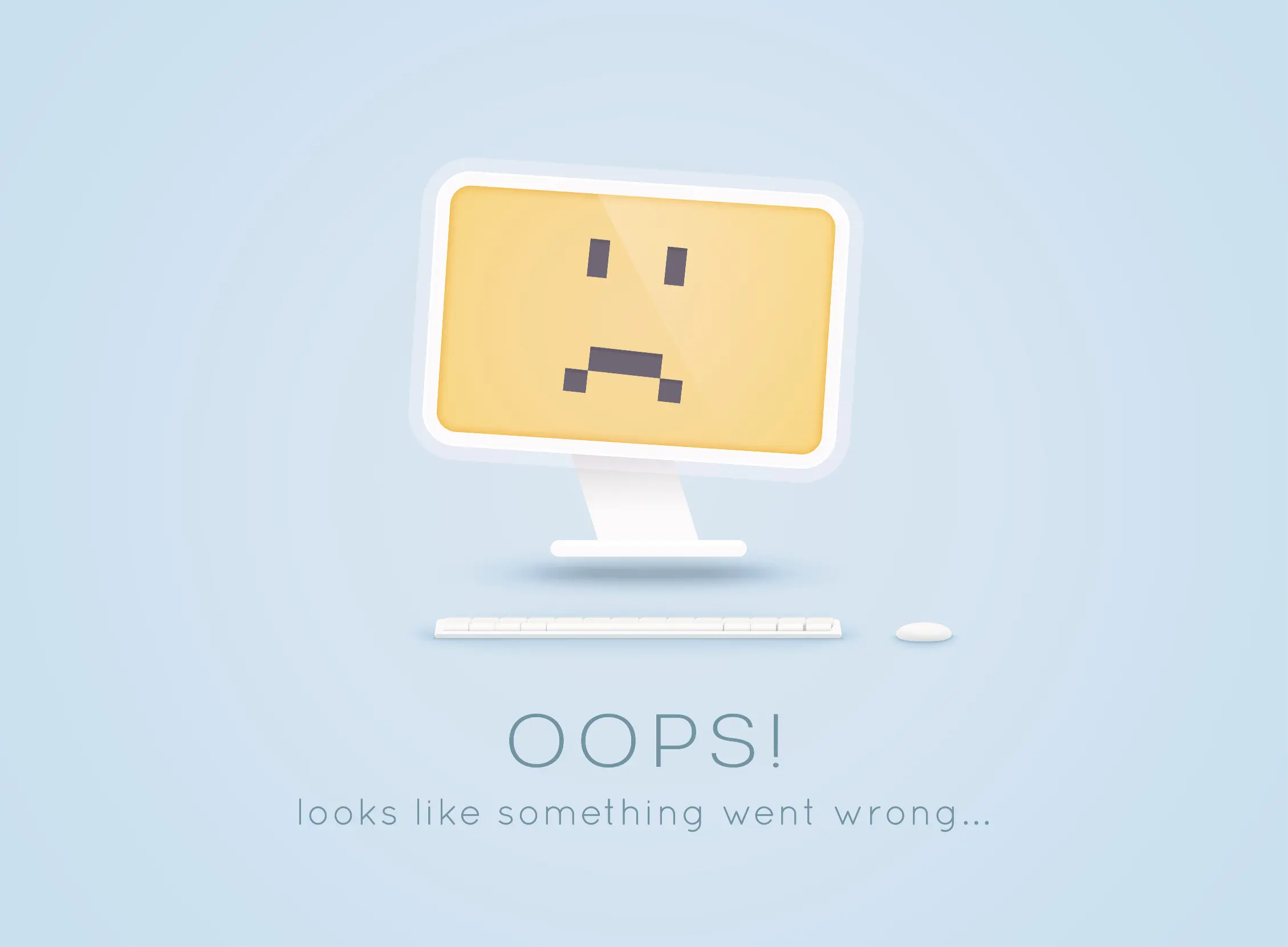
Have you ever considered whether your website might be quietly turning potential customers away? For many businesses and organisations, minor design mistakes can add up to major missed opportunities. A confusing layout, a slow load time, or a weak call-to-action might seem like a small mistake, but together they can mean the difference between gaining a new customer or losing one to a competitor. Research shows it takes just 50 milliseconds (that’s 0.05 seconds) for users to form an opinion about your website. Even more telling, according to a study by Adobe, 38% of people will stop engaging with a website if the content or layout is unattractive.
As this research suggests, the power of first impressions can’t be overstated. First impressions are critical. The good news is that once you know what to look for, most website mistakes are surprisingly easy to fix, and the results can transform how people experience your brand online. In this blog, we’ll uncover and explore five of the most common website pitfalls that could be costing you customers. More importantly, we’ll show you how to avoid them so your site works better for you, helping you turn more visitors into loyal clients.
1. Slow Load Times: The Fastest Way to Lose Trust
We’ve all experienced clicking on a link only to watch the page crawl into view. In today’s fast-paced digital world, those few extra seconds are often all it takes for a potential customer to lose interest and leave. Research consistently shows that visitors make snap decisions about whether to stay or go, and a sluggish website almost always drives them away. Google Consumer Insights found that 53% of mobile site visitors will leave a page if it takes more than three seconds to load.
Website load times statistics consistently show that website load times can fundamentally alter your website’s user experience, customer engagement, and conversion rate. The good news is that slow load times are fixable. Optimising images before uploading ensures smaller files without compromising quality. Reliable hosting provides the speed and stability your site needs to handle traffic confidently. And by streamlining your site, removing unnecessary plugins or cleaning up bloated code, you create a smoother, faster experience. A fast website improves usability. It signals professionalism, reliability, and respect for your visitors’ time. In short, speed builds trust.
2. Confusing Navigation: When Visitors Can’t Find Their Way
A website should feel as intuitive as walking through a well-designed store. It should be simple to explore, effortless to find what you need, and free from frustration. A recent survey found that 94% of people say easy navigation is the website feature that they value most. When visitors are forced to click through endless menus or guess where important information is hidden, they quickly lose patience, and often leave altogether.
The solution lies in clarity. Streamlined menus, logical site structures, and straightforward labels make navigation effortless. Avoiding jargon ensures visitors instantly understand where to go, while guiding them toward a clear next step, whether that’s getting in touch, booking a call, or diving deeper into your content. When navigation is simple and intuitive, visitors feel confident and supported. That confidence directly translates into higher engagement and stronger conversions.
3. Not Mobile-Friendly: How Poor Design Alienates Your Audience
As of 2025, 62.45% of all internet traffic is mobile. With more than half of all web browsing now taking place on mobile devices, [internal link – responsive web design] a site that doesn’t adapt seamlessly to different screen sizes risks losing a significant portion of its audience. Visitors expect a smooth experience whether they’re on a phone, tablet, or desktop, and if your site doesn’t deliver, they won’t stick around.
The key is to prioritise a mobile-first, responsive design approach. Responsive layouts, scalable images, and buttons designed for smaller screens ensure functionality across devices. Regular testing on different devices and browsers helps catch issues before your visitors do. A mobile-friendly site is increasingly coming to be seen as a necessity. Without it, your brand feels outdated and unprepared for how people actually browse the web.
4. Weak Calls-to-Action: Why Visitors Leave Without Converting
Every page on your website should serve a clear purpose, guiding visitors toward the next step. Without strong calls-to-action, users are left guessing what to do, and more often than not, they choose to do nothing. Research collated by HubSpot highlights how effective Calls-to-Action (CTAs) drive better conversions.
Effective CTAs are specific, action-oriented, and impossible to miss. Phrases like “Book a Discovery Call,” “Download Your Free Guide,” or “Donate Now” remove ambiguity and invite immediate engagement. Visually distinctive buttons help these prompts stand out, while thoughtful placement at natural decision points ensures they appear right when visitors are ready to act. A strong call-to-action transforms passive browsers into active participants, whether that means a customer, client, or supporter.
5. Stale Branding: The Hidden Cost of Looking Outdated
Your website is often the first impression people have of your business, and if the design feels dated, inconsistent, or overly generic, it can undermine trust before a single word is read. Visitors quickly associate a lack of visual cohesion with a lack of professionalism, making them less likely to engage further.
The solution is to create a consistent and authentic brand presence. A unified colour palette, clear typography choices, and a distinctive image style all contribute to a polished look that reflects your values and resonates with your audience. Replacing overused stock photos with genuine, authentic imagery adds credibility and makes your brand feel human and trustworthy. When your branding is cohesive and up to date, it sends a powerful signal that your business is professional, relevant, and worth engaging with.
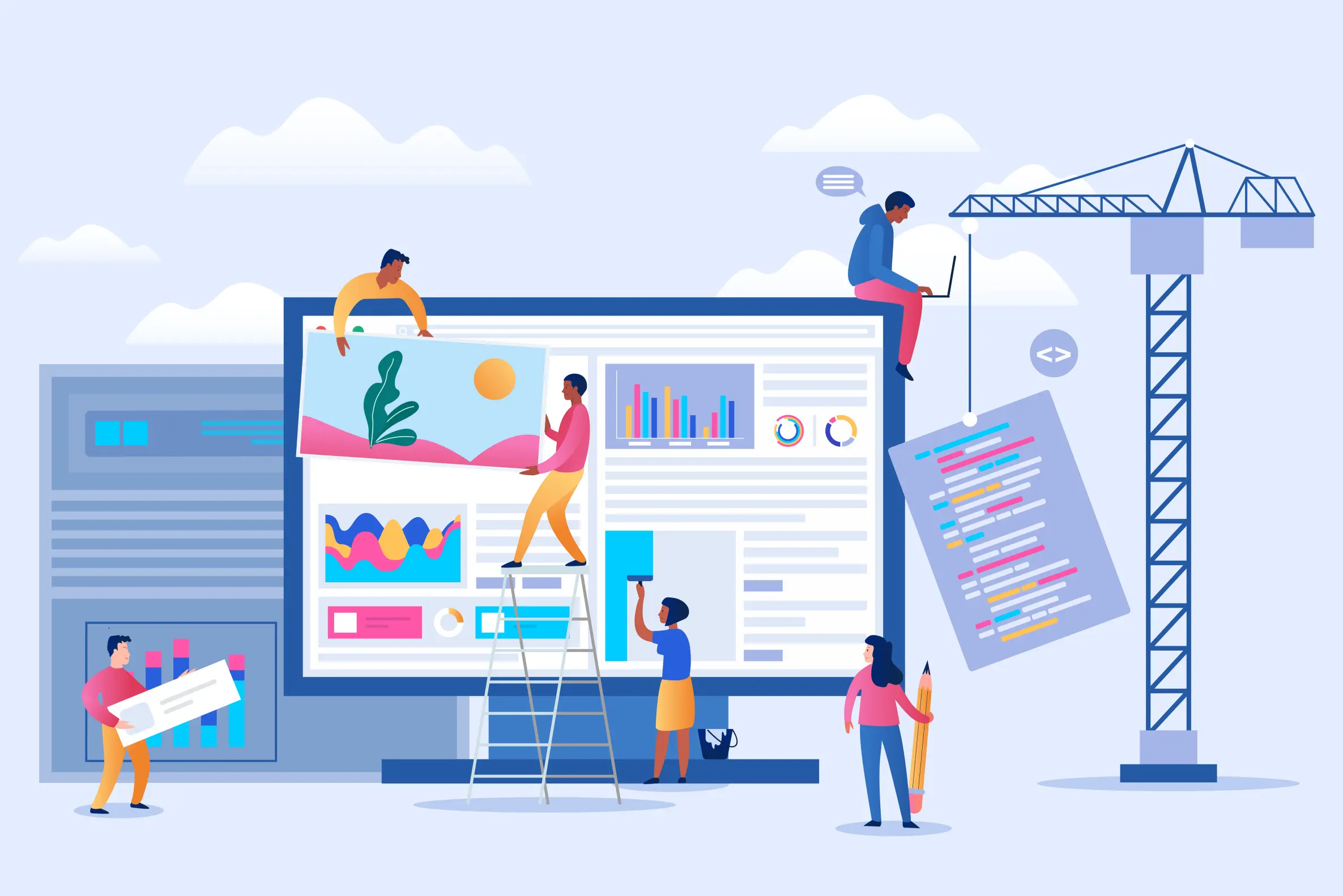
Conclusion: Turning Website Design Mistakes into Opportunities
A website doesn’t have to be flashy to make an impact, but it does need to be fast, clear, and professional. Addressing these five common mistakes, you can improve the way visitors experience your site. And by boosting user experience you’ll increase the likelihood that your visitors will stick around, engage with your content, convert, and return.
If you suspect your site may be falling into some of these website traps, Grinning Graphics can help.
At Grinning Graphics, we specialise in creating unique websites for brands and organisations that want better. We design platforms that work hard for your business, building trust, showcasing your brand, and guiding visitors seamlessly from curiosity to action.
Contact us today and let’s build a website that delivers real results. Don’t let avoidable design errors hold your organisation back.


